Client
Kalye Sound is a week-long annual festival celebrating five decades of Filipino music. It treats OPM as inheritance, not entertainment.
Task
Build the full identity system, from logo and typography to merch and environmental graphics, for a festival that spans five decades and multiple stages.
Audience
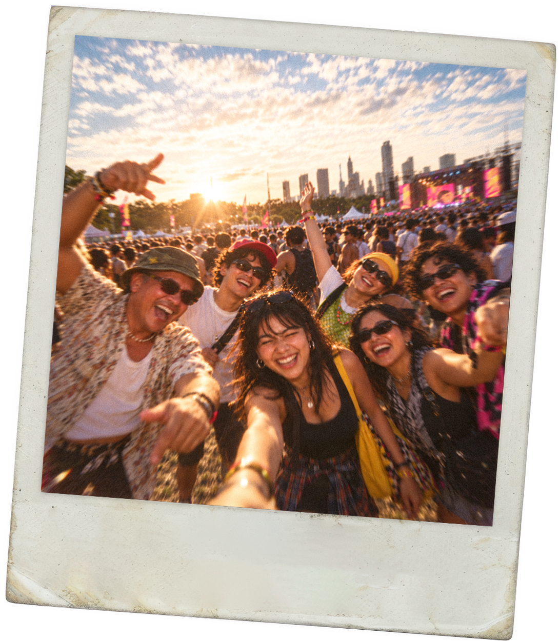
Every generation of Filipino music lovers, from Gen X raised on jukebox ballads to Gen Z discovering OPM for the first time. Built for the diaspora too.
Why
Filipino music has no home that honors its full history. Kalye Sound gives five decades of OPM the stage they deserve.
Where Filipino music finally comes home.
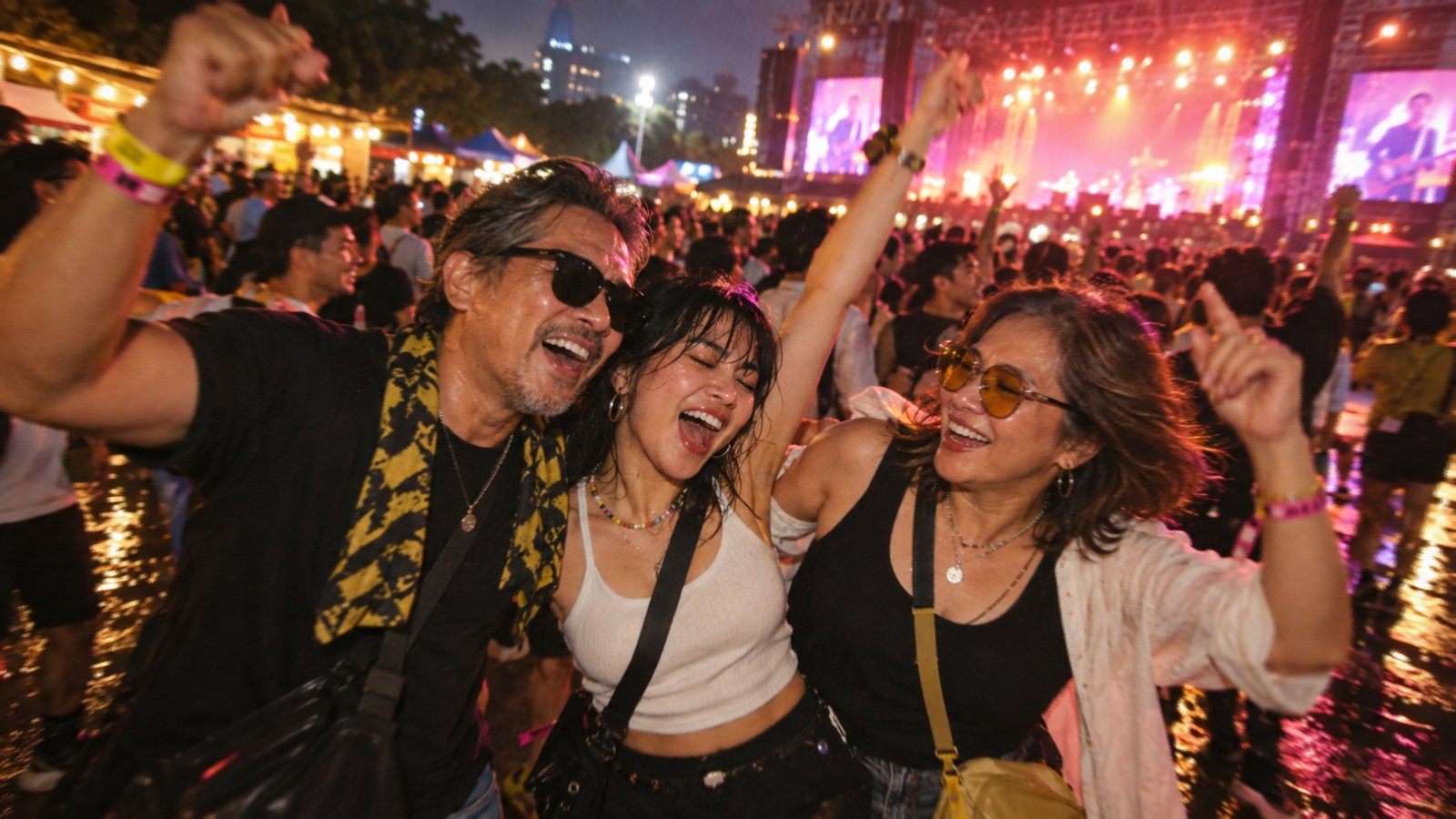
Five decades of music. Nowhere to hold them.
Filipino music has always been one story, told across five decades, with no room to tell it whole.
Don't pick a side. Hold it all.
Personality
Authentic
Celebratory
Gritty
Timeless
Unfiltered
Authentic
Unfiltered
Gritty
Timeless
Celebratory
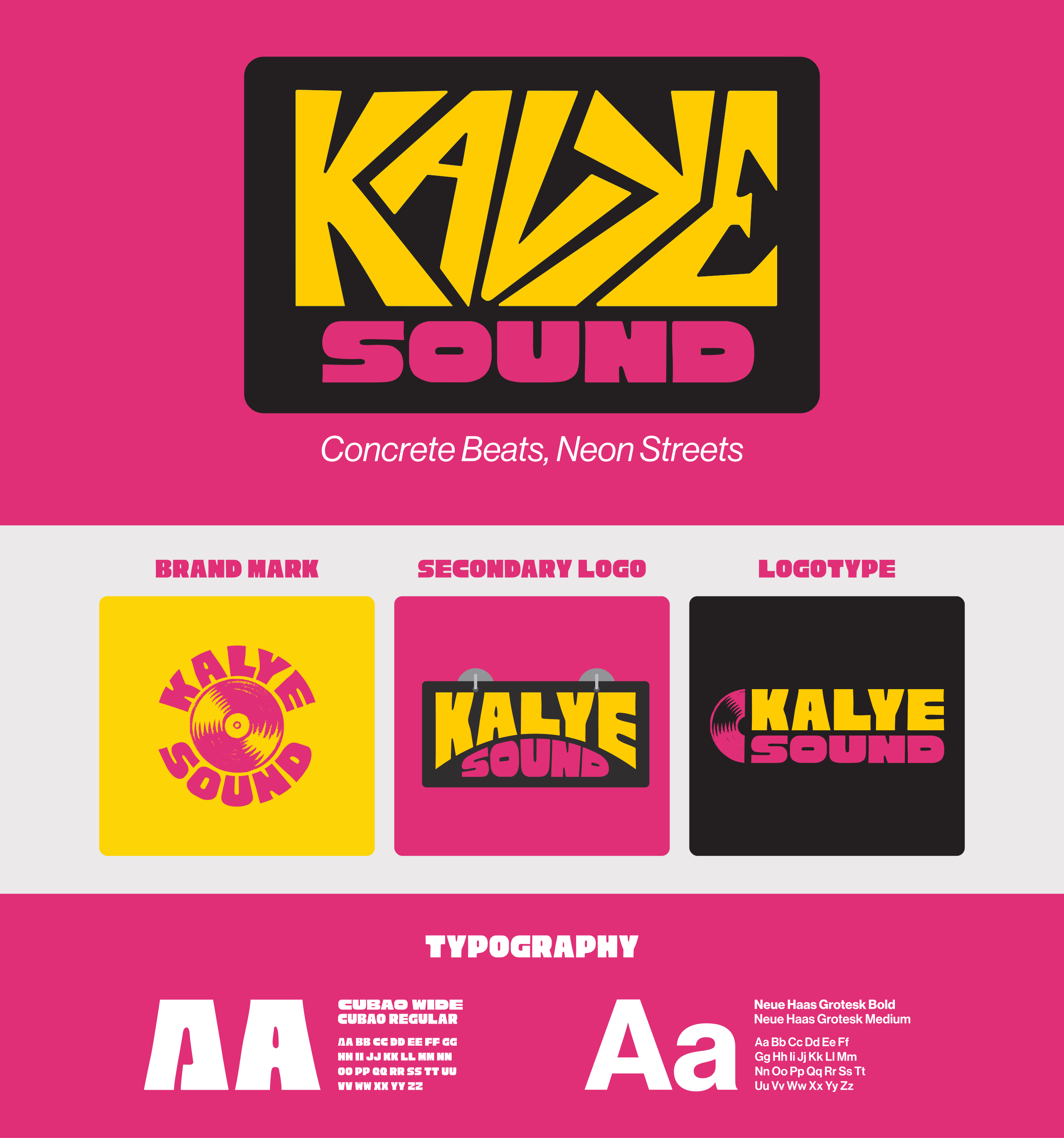
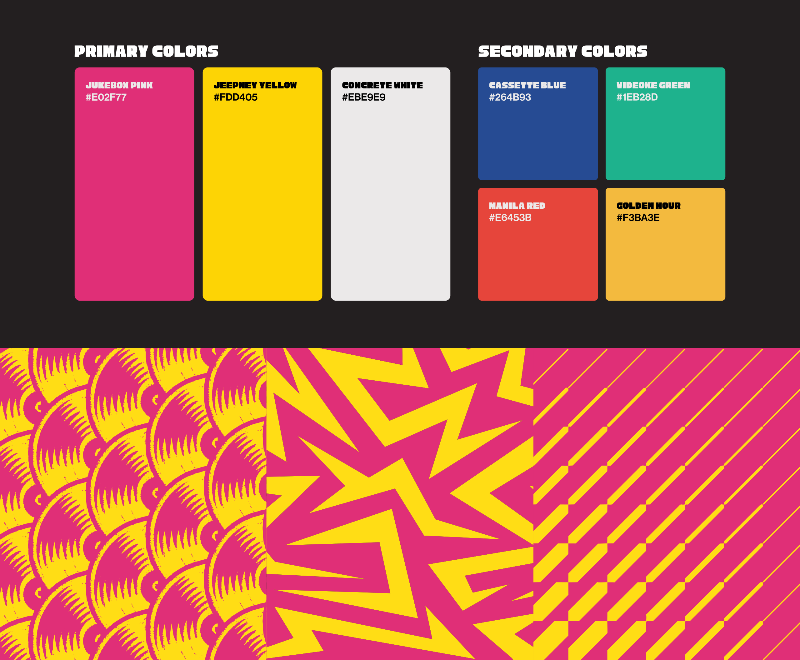
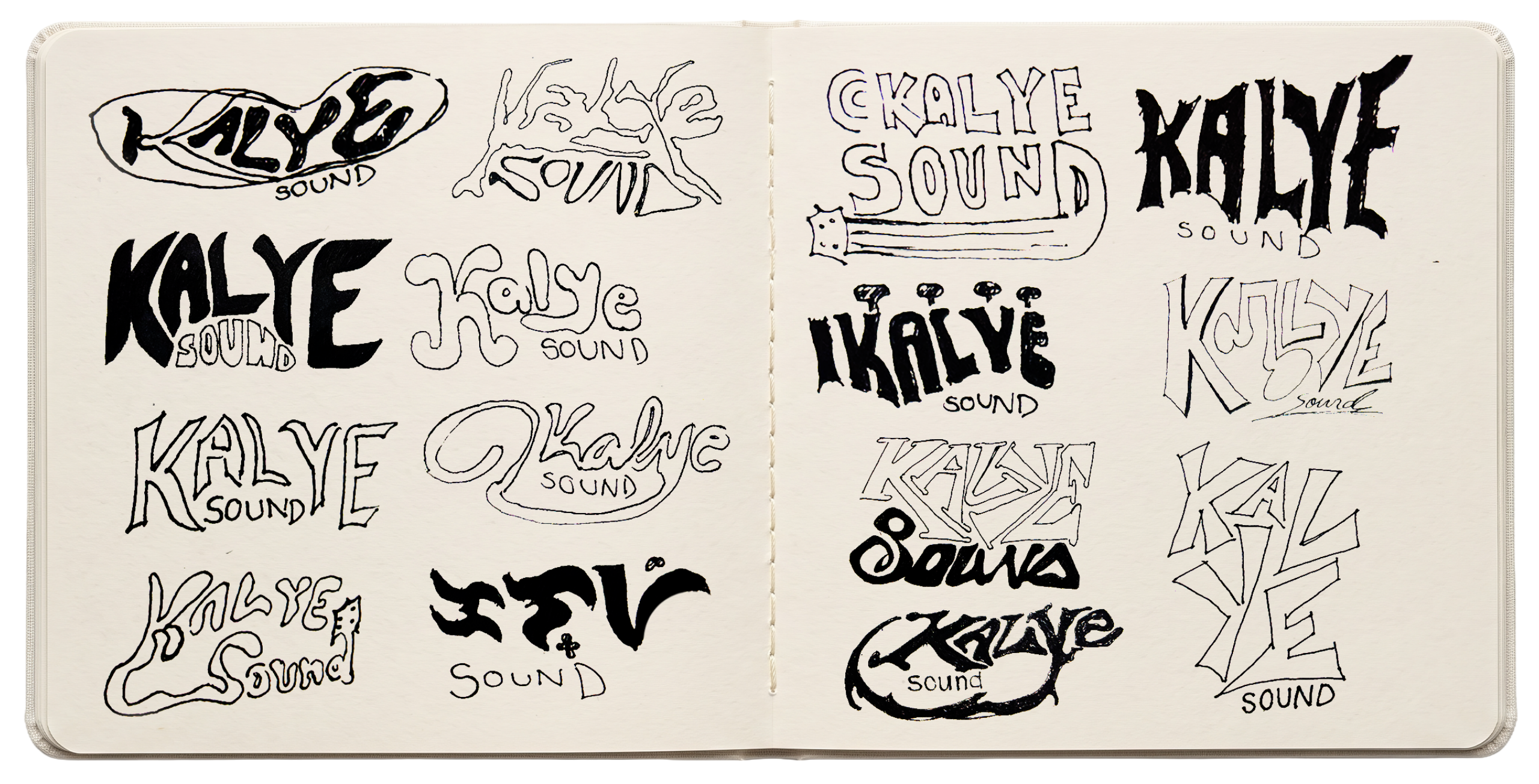
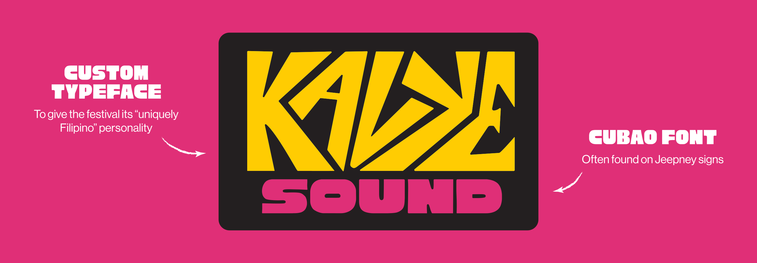
Jukebox-inspired lettering, bold color, and screen-printed vinyl and cassette motifs. Cubao gave the type its angular Filipino character, while the icons and patterns carried the brand across merch, wayfinding, and environmental graphics.
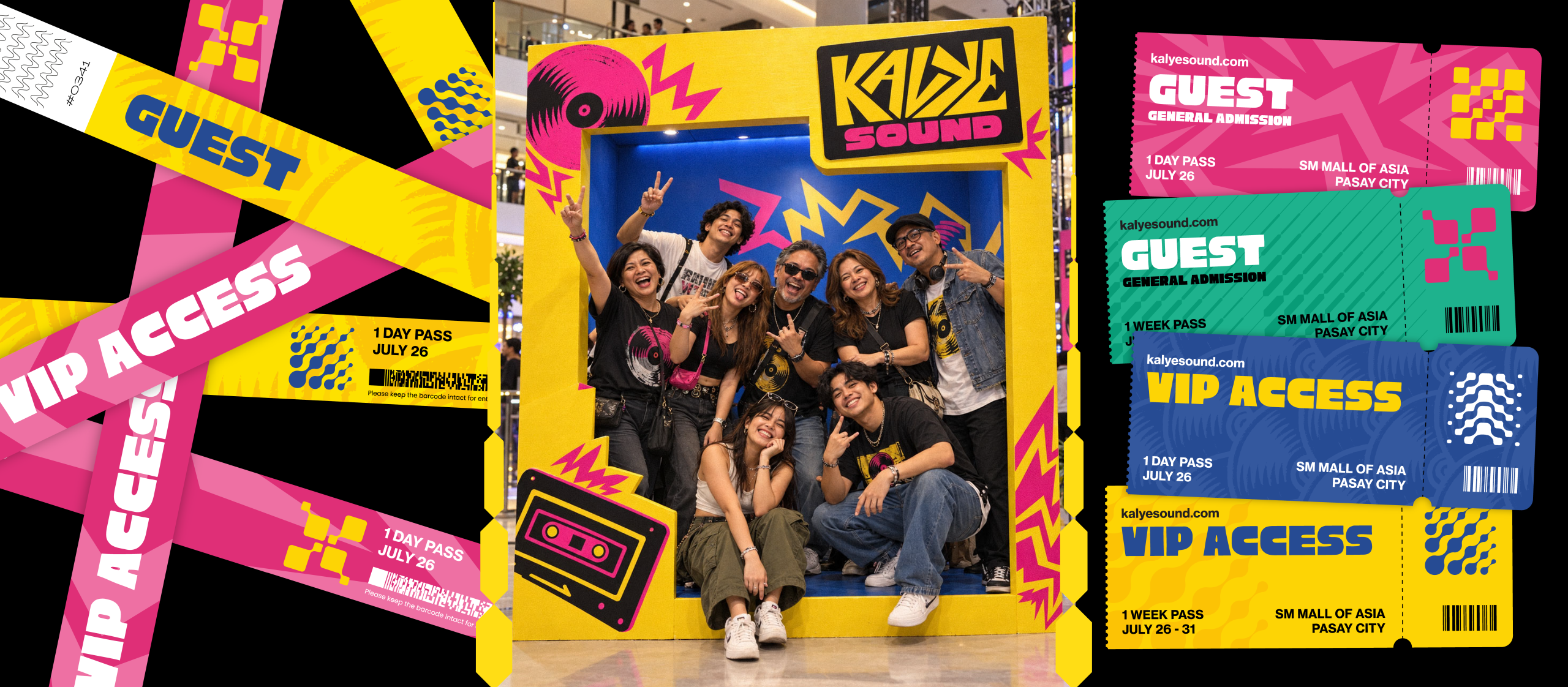
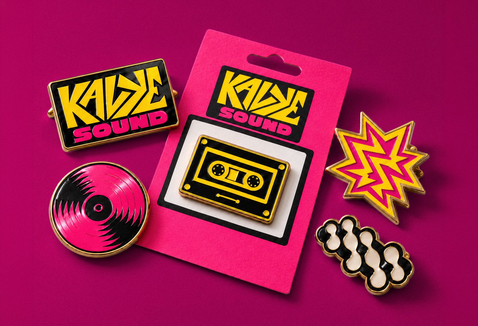
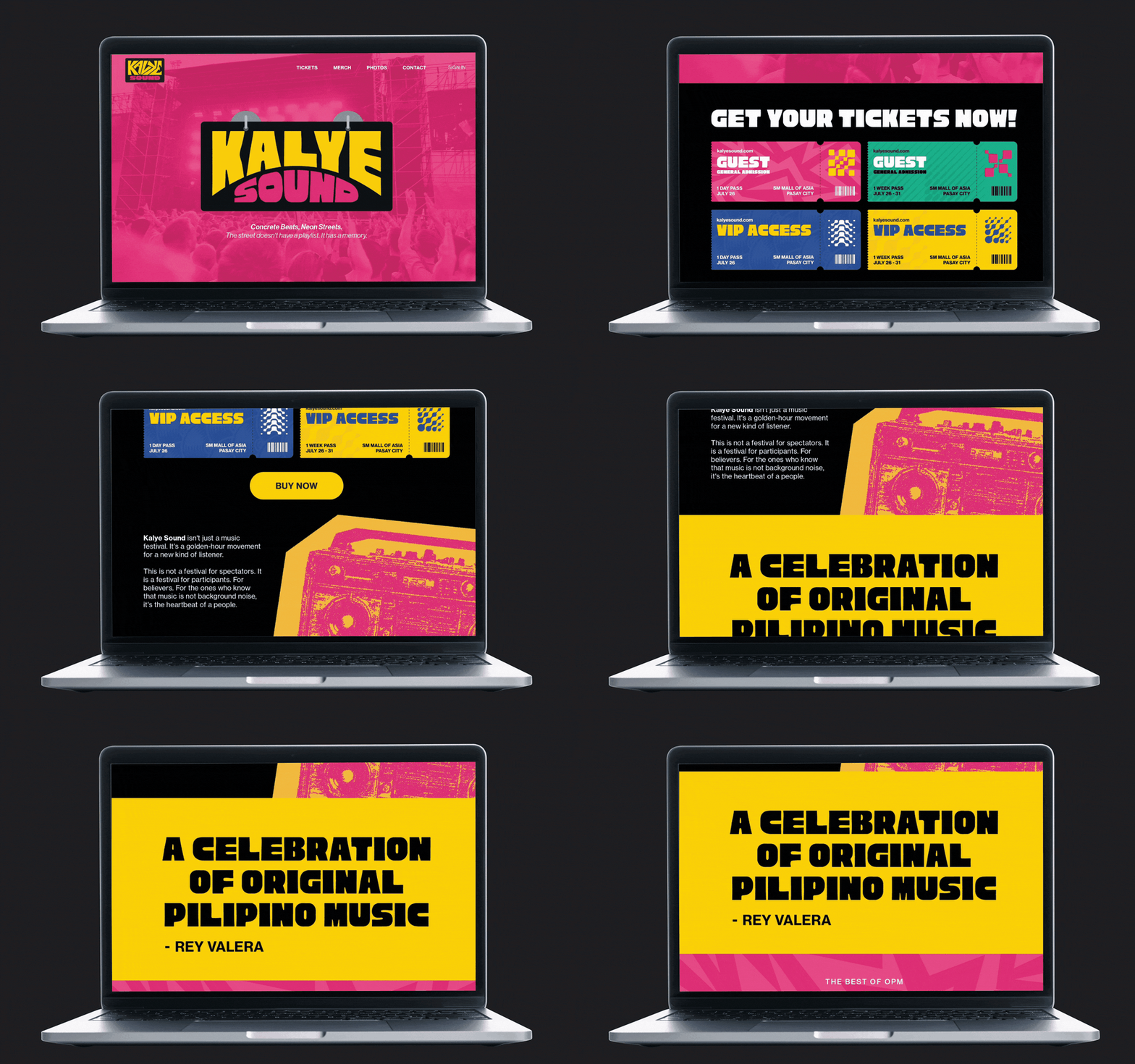
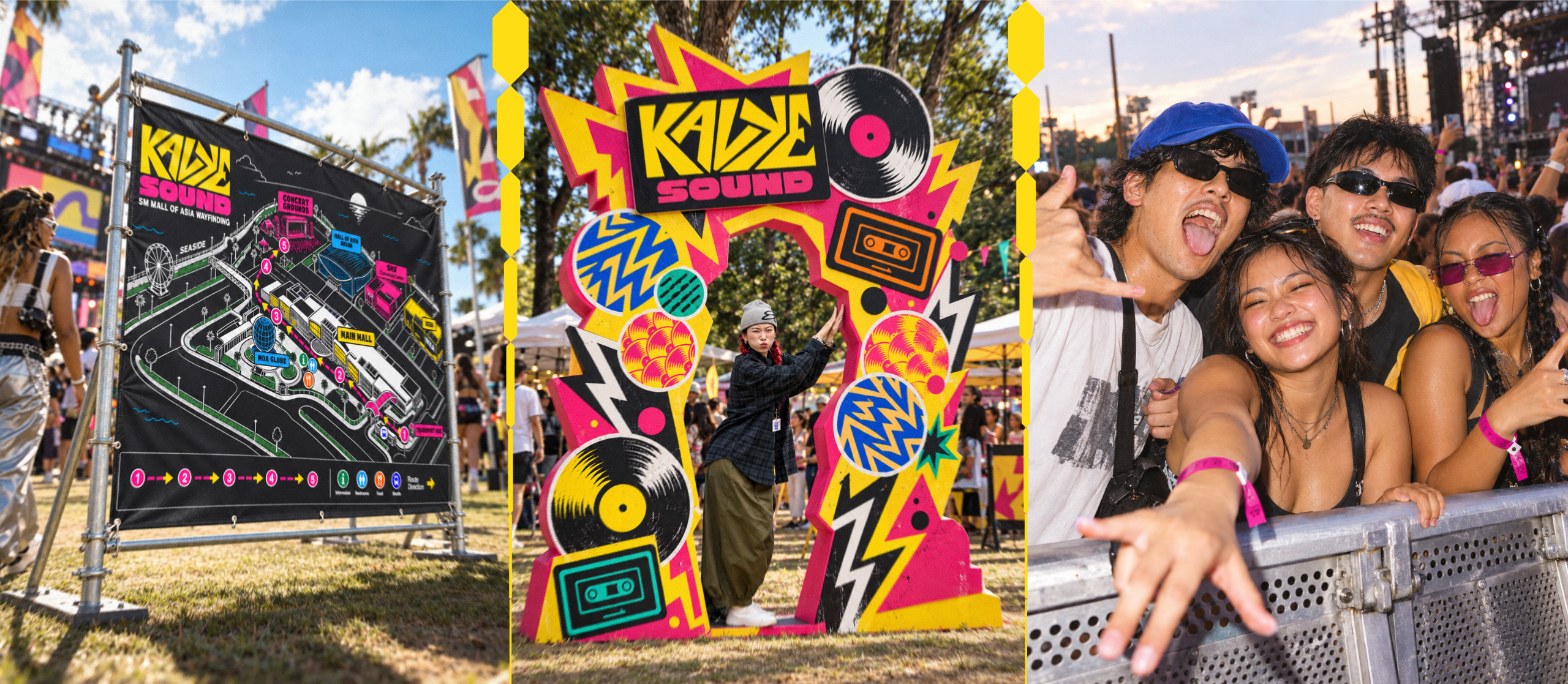
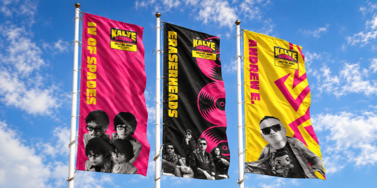
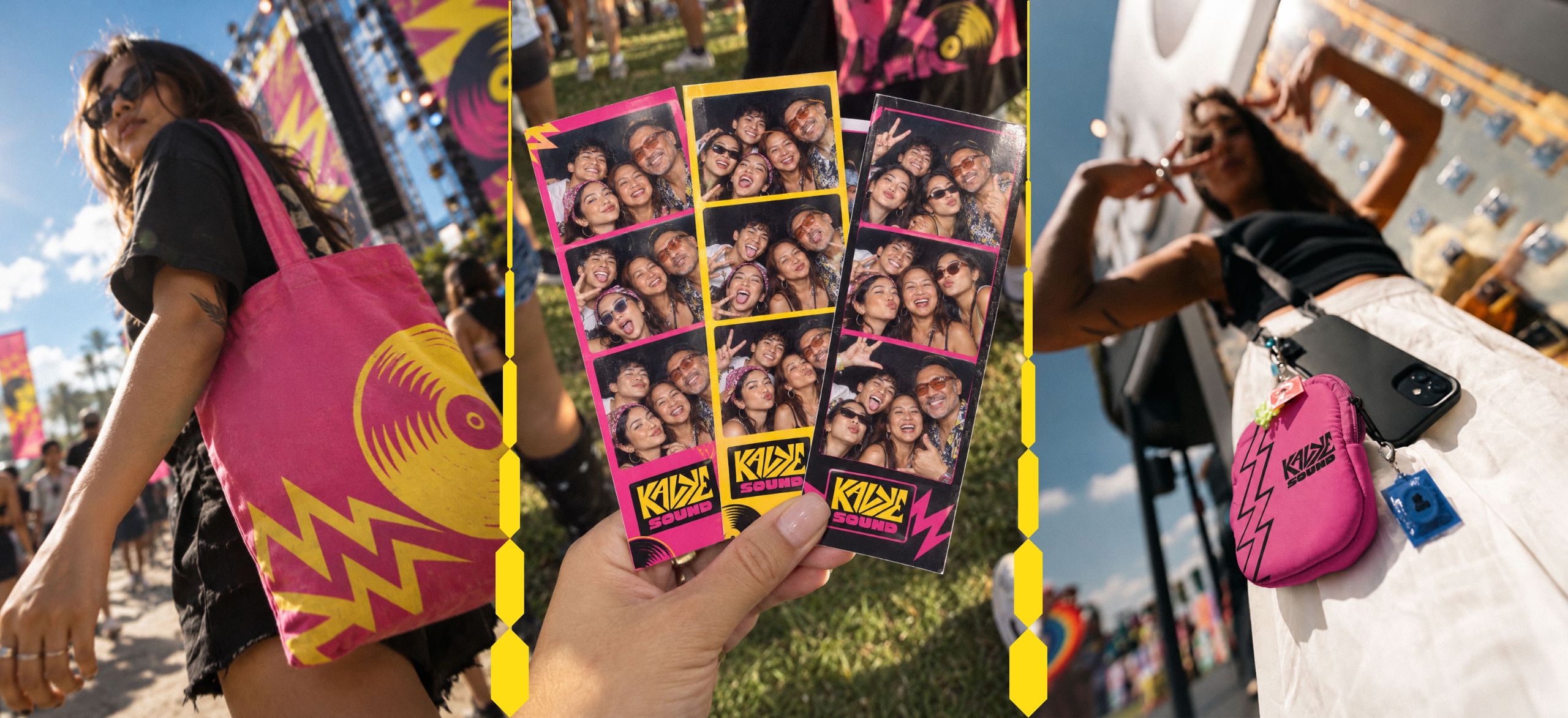
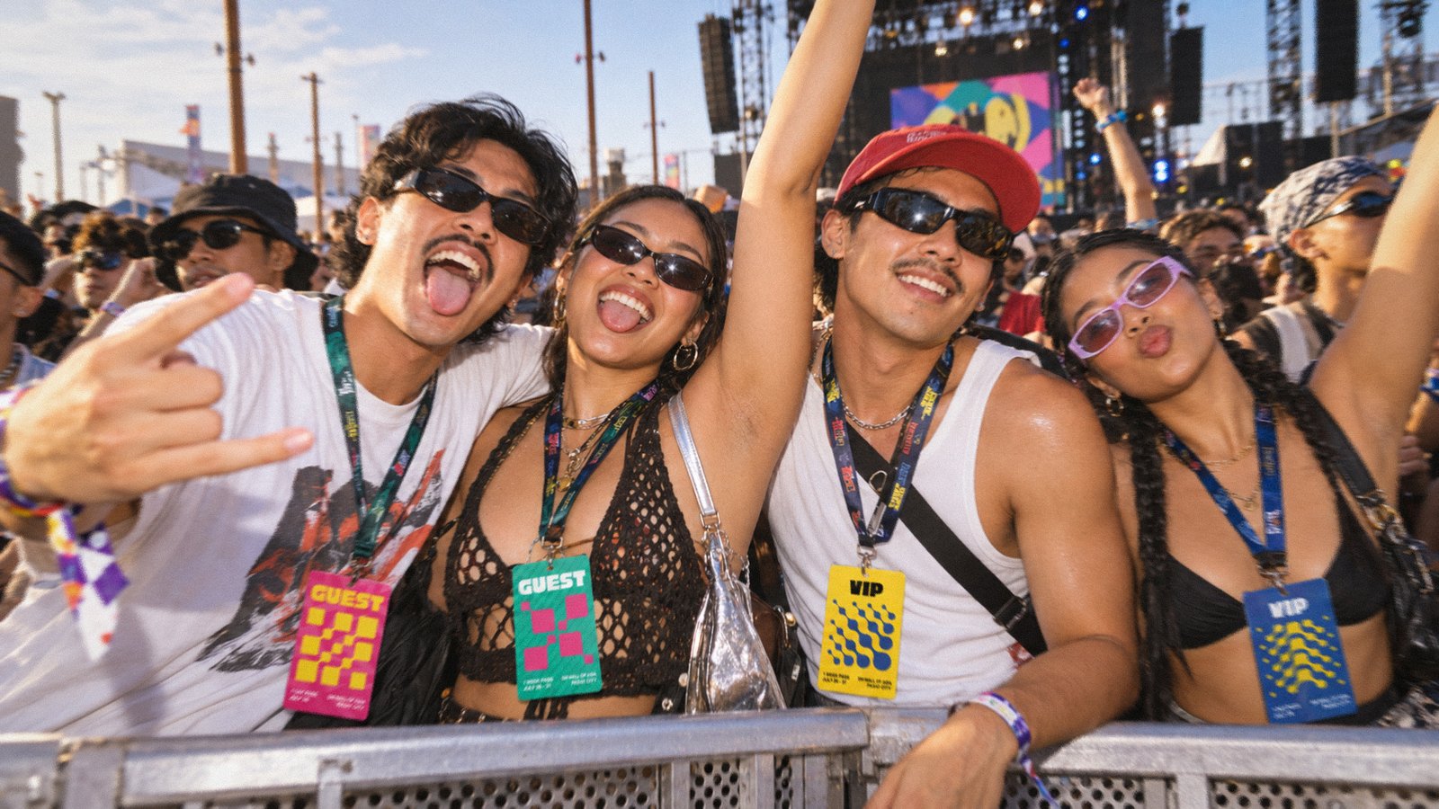
Kalye Sound launched with a complete identity system built to scale across five decades of music and seven days of programming. It gave OPM a visual language that felt both rooted and current, and a platform built to grow with every edition.
100%
Brand coverage across all festival touchpoints
40+
Deliverables shipped, from logo suite to merch and wayfinding
4x
Generational reach, from Gen X to Young Adults in one audience
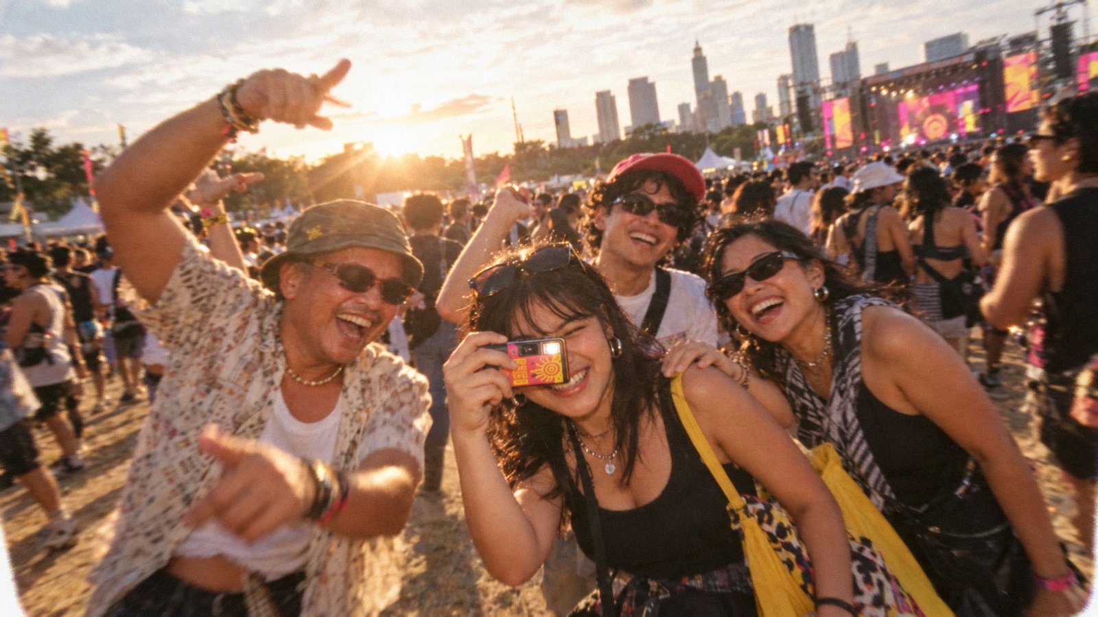
This project proved a brand can hold multiple generations without diluting itself, as long as insight leads the aesthetics. The real constraint was restraint, knowing when to stay loud and when to let the music speak. Given more time, I would push the environmental graphics further, treating the venue as part of the identity rather than a backdrop.